
One of the first digital typefaces that really fascinated me was Zuzana Licko’s Emperor (plate 2).
It was the late eighties and I had just begun working with the Mac. Zuzana Licko’s pixels were an eloquent answer to the limited typographic capacities of early desktop technology.
Modular alphabets are not an invention of the computer age: aside from the mosaic letters of antiquity, the first modular or pixelated alphabets are found as early as the 1890s in illuminated signs that made their appearance in metropolitan areas after the invention of the electric light bulb. During the 1920s the designers of the Bauhaus created several modular alphabets, such as those used as stencils in order to apply the New Typography to objects; the most sophisticated of these typefaces was Josef Albers’ Schablonensschrift (Stencil Typeface), which combined a few elementary shapes or modules to form all characters in several sizes (plate 1).


As for me, I created my first bitmap font in 1990
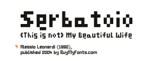
and baptized it (This is not) My Beautiful Wife (plate 4). The starting point for the font was a series of architectural floor plans which I had scanned for another job. I noticed that the architects’ lettering, which due to a sharp simplification consisted of only a few pixels, was still amazingly legible.
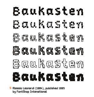
(This is not) My Beautiful Wife is based on the minimum space needed to define the characters of the alphabet: 6 Pixels including ascenders and descenders. The typeface was published by BuyMyFonts under the name Serbatoio in 2004. Later, in 1994, I designed FF Baukasten (plate 5), a bitmap typeface that appeared to have been struck by an earthquake.
FF Baukasten showed that pixels on the screen now enjoyed more freedom than before. By layering the various fonts of the FF Baukasten and attributing different colours to each layer, splendid chromatic effect could be achieved.
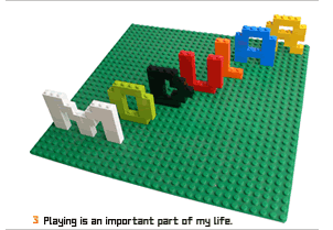
I became totally infatuated by the beauty of modularity and could not shake the thought of founding a completely modular typeface family (plate 3). My goal became to construct a skeleton consisting of identical modules that could be easily replaced by others, so that one single design could generate an endless number of typefaces.
© 2007–2024 Alessio Leonardi (last update 6th December 2024, 22.40 MET)